Know where next year's intake really stands, compared with the same point in last year's cycle rather than against a finished year.

PIPELINE HEALTH
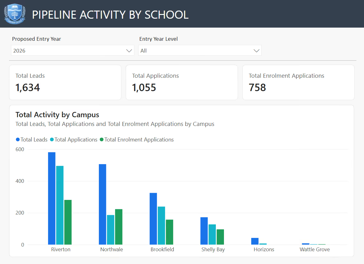
Enrolment Demand Multiple shows whether you're oversubscribed. Application-to-Enrolment Rate shows how many applicants convert. Offer Acceptance Rate shows how many offers land. All calculated per school and per entry year from your own enrolment system data, so every figure traces back to a record you can open.
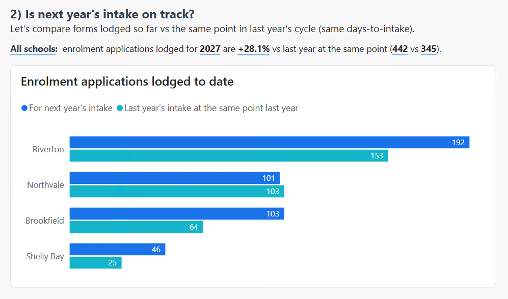
SAME POINT, LAST YEAR
Comparing a part-finished intake against a completed one tells you nothing. We match on days-to-intake, so this year's pipeline is measured against exactly the same point in last year's cycle, and against the previous year's actual intake as a target. That gives you a number you can take to a board meeting.

TRENDS & FUTURE OUTLOOK
Leads, enquiries, applications and enrolment forms tracked month by month against the same period last year, with the shape of the current year projected out to its close. You can see a soft month forming while there is still time to act on it, rather than reading about it after the intake has closed.
BUILT FOR SCHOOL GROUPS
Schools in a group rarely follow identical processes, and comparing them naively hides that. We surface it instead: which campuses use enquiry forms and which don't, where a conversion rate above 100% reflects a processing habit rather than real demand, and which records predate your current system and should be excluded. You get a comparable view across campuses, and an honest account of where the underlying data can and can't be trusted.